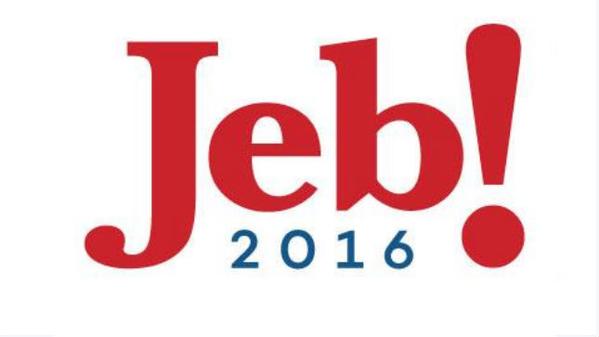
So Jeb Bush is finally in the 2016 GOP president race. His logo is about as charismatic and creative as he is. Basically the stupid Jeb! logo is the same logo he used throughout the 1990s for his governor campaigns in Florida. Leaving out the Bush name? Gee, I wonder why.
| Jeb Bush 2016 uses same lame logos since the ’90s |
|---|

|
Below are the logos Jeb Bush used in the ’90s.
Jeb! has used the same logo since 1994. pic.twitter.com/QGsbWGr7Ot
— Andrew Kaczynski (@BuzzFeedAndrew) June 14, 2015
Jeb Bush will NEVER get my vote. The GOP is stupid enough to elect another Bush then I’m voting third party for the first time ever.
Below are a few logos that would have been far more accurate for Jeb Bush:
Jeb Bush unveils campaign logo: http://t.co/Kh1thuIpoU What it looks like to me: pic.twitter.com/U5i0crYh3H
— Jon Feere (@JonFeere) June 14, 2015
This offered up as Twitter-joke, but actually works better than original logo & Jeb can pull it off authentically too pic.twitter.com/nlAVudmD66
— Jeff B@AoSHQDD (@EsotericCD) June 14, 2015
Jeb Bush gets his logo!
#RedNationRising #NoMoreIn16 #tcot #PatriotRetort #Cruz2016
http://t.co/e4uszdr9OE pic.twitter.com/70inbq3iLu
— Diann Russell (@DiannyRants) April 18, 2015
Jeb's new Logo: pic.twitter.com/N57o5uJ4Vk
— To Thrive (@ToThrive) June 14, 2015